Editor's Picks

Images and insights from Ezra Barnea’s journey to Cyprus’s...
Ezra Barnea
|
Jun 13, 2026

Endangered oak Quercus hinckleyi shows strong genetic...
Website Editor
|
Jun 09, 2026

New paper should significantly change our approach to...
Steve Potter
|
Jun 09, 2026
Plant Focus

Roderick Cameron and Carlos Vila-Viçosa give an account of this intriguing species from northwestern Iberia with a complex taxonomic and...
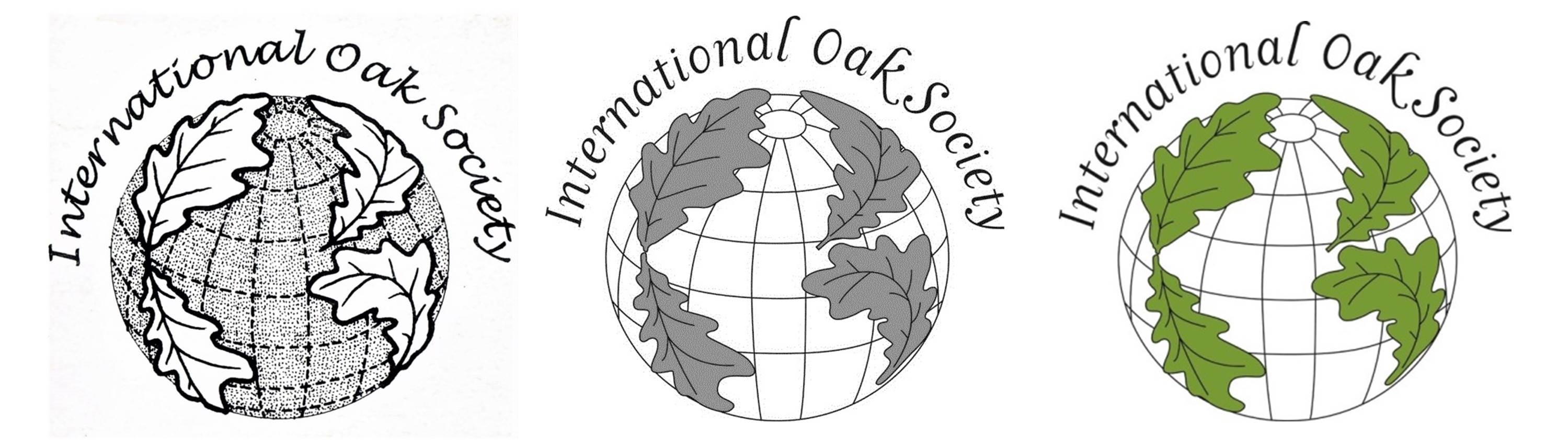
The first Journal of the International Oak Society, No. 1, March 1992, was a rather tentative publication produced to test the waters of oak interest around the world. The editor was Nigel Wright, who produced that trial issue on a photocopying machine in his spare time. Nigel also served as Secretary on our first interim board and was one of the three incorporating officers (along with Peter van der Linden and Guy Sternberg) who signed our corporate charter. On the front cover of that first issue of International Oaks (then the Journal of the International Oak Society) was a drawing that Nigel had made of what appears to be a representation of Quercus alba and that was the first logo of the International Oak Society. As No. 1 was not produced in very large numbers it was reprinted in 1999 as a Special Commemorative Republication - No. 1 March 1992-99. Both this and the original version are available on the International Oak Society website.

In the late 1990s it was decided we should have a logo that would immediately identify the Society and also say something about us, and it was clear that an artist would be needed. At the time I was in frequent contact with Niki Simpson at the Royal Horticultural Society Garden, Wisley. Both the Sir Harold Hillier Gardens and RHS Wisley were using BG-Base™ as the garden and herbarium database. Niki was BG-Base Administrator for the RHS database, and we often discussed how to use it to our best advantage. Niki was also a freelance botanical artist and so, when the question about a logo came up, I decided to consult her, and we agreed that the logo should contain oak leaves. Niki was keen to make sure the new logo appeared very different to the logo of the National Trust, which features a leafy shoot of Quercus robur with acorns and which was already well known throughout the United Kingdom. The National Trust logo was designed by Joseph Armitage and first appeared in 1935.
While English oak was a logical choice for the National Trust, it would hardly be suitable for an international society, particularly one with most of its members in the USA. We could have voted on it but I think there would have been a wide range of suggestions with probably none of them acceptable to everybody. I then remembered something that had happened not long before.
In 1996 I visited Massachusetts with the intention of looking at, and collecting specimens of, hybrid oaks. I was lucky to be able to stay with botanist and plant collector Stephen Spongberg and his wife at their home on the Charles River. I was sad to hear of his passing earlier this year but was reminded of an amusing incident at his home. He showed me a scar he had on his back and asked if I knew what it was as he thought maybe he was allergic to something. The answer was right in front of me, as there on the riverbank was a large plant of giant hogweed (Heracleum mantegazzianum)!

My time there was very productive, and I was taken around several sites known for their oaks. At the Arnold Arboretum a team of arborists assisted me in collecting from some of the enormous trees that had stood for many years and must have been well known to people like Ernest Wilson, Alfred Rehder, and Charles Sargent. One of the trees I collected from was labeled Quercus robur × alba. At Mount Auburn Cemetery I found a fastigiate oak labeled “Quercus robur heterophylla – new variety of English oak” and this was clearly of the same parentage as the Arnold tree. The Mount Auburn tree is no longer there but the large Arnold tree remains, close to its sister of the same parentage.

So when trying to think of a suitable oak to use for the logo my mind was immediately drawn to this hybrid. The cross between Q. alba and Q. robur has been named Q. ×bimundorum, the epithet being Latin for “of two worlds”, and seemed to be a perfect choice, uniting the Old World and the New World. It was described by British-born botanist Ernest Palmer in 1948 from a tree growing on a hillside close to the Arnold Arboretum. My suggestion to use this hybrid in the logo was immediately accepted. I showed the specimens of the hybrid to Niki and she came up with the idea of emphasizing the international nature of the Society by arranging four oak leaves on a globe, representing North America, South America, Eurasia, and Africa.
The original logo was hand-drawn in black and white; we had no website or color in the journal in those days. It first appeared on the cover of International Oaks No. 10, Spring 2000. When color printing and a website became possible, some small alterations were made to the logo. For the publicity materials for the IOS Conference in Bordeaux in 2012, designer Marie-Paule Thuaud, under the guidance of Béatrice Chassé, digitized the logo, colored the leaves green, made the meridians and parallels clearer, and changed the font of the text from Lucida Handwriting to Monotype Corsiva. Starting with No. 24 (2013), the logo now appears on the front and back cover of every issue of International Oaks, in black and white, and in color on our website and on the last page of International Oaks where our Mission and Goals are stated.
Apart from its use in International Oaks, the logo also appears elsewhere, on items such as T-shirts and badges, and a group of well-deserving recipients will have seen it on their Lifetime Service Award or the Special Service Award.

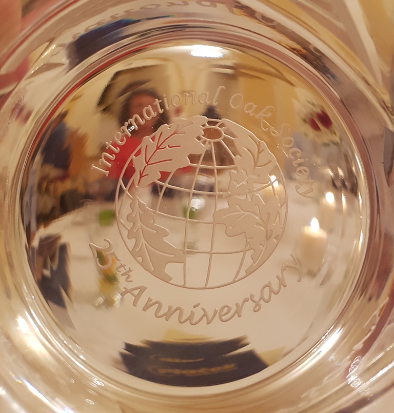
Perhaps the most inspired use of the logo was a very pleasant surprise to those attending the 25th Anniversary of the International Oak Society in 2017 at Dušan Plaček’s Quercetum in the Czech Republic. During the birthday dinner at Podĕbrady Castle, we were each presented with a pair of handsome Bohemian crystal tumblers with the logo beautifully engraved on the base.
Niki is delighted that her original concept for the logo is still in use and even more so that it has been digitized and brought up to date. She has continued with her botanical artwork, receiving a RHS Gold Medal for her exhibit of watercolor paintings in 1998. In 2004 she received a Queen Elizabeth Scholarship Trust award for a project to experiment with digital techniques for botanical illustration, in which she now specializes and for which she has received both RHS Gold Medals and the prestigious international Jill Smythies Award (2018) from the Linnean Society of London. Her main interest is in illustrating species of the British flora. For those interested, there is lot more information about her botanical illustrations on her website www.visualbotany.co.uk
Acknowledgments
For helping with some of the details for this article I would like to thank Matthew Buckley, Béatrice Chassé, Niki Simpson, Roderick Cameron, and Guy Sternberg.
Content by the Same Author
The International Oak Society acknowledges the generous support of the following institutions:
Supporting Institutional Members


![]()
Standard Institutional Members


![]()